An article written in 2011 on ShutterPhoto.net by D. Travis North on one of my New York City photos.
Sometimes, the power behind a photograph isn’t the subject or the composition – it’s the finishing touches. I’m a fan of getting a shot right in-the-camera. But sometimes it’s more than simply choosing the right depth of field and achieving the right exposure. The finishing touches really do matter. To prove that point, I’d like to share with you a photo, Manhattan Through The Bridge, by Geraint Rowland.
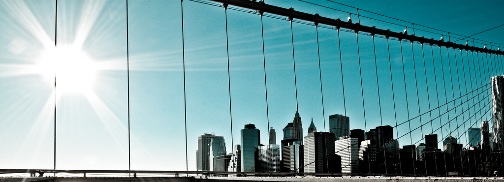
Manhattan Through the Bridge by Geraint Rowland
The skyline featured in Geraint’s photo is world famous. It is the financial capitol of the world, home to some of the most well known skyscrapers and a well photographed, well documented skyline. As if the title of the photo didn’t give you a clue, it’s Manhattan Island in New York City, New York, USA. When dealing with such a well-known subject, the natural inclination of any good photographer is to shoot it in a unique manner. But photographers have been shooting this particular subject in unique ways for as long as the consumer has afforded the camera (a very long time). You could shoot it from different sides – shoot it from New Jersey, or shoot it from Brooklyn – you can even shoot it from the Brooklyn Bridge. Geraint shot from the Manhattan Bridge (which is right next to the somewhat more famous Brooklyn Bridge). And while I’d like to commend Geraint for his vision in choice of vantage points, I can’t help but to think that this shot has been done before. But something here is unique. What is it?
What sets Geraint’s photo apart from other photos of this world famous skyline is all in the finishing touches. It’s the colors of the sky: On Flickr, he sub-labels the shot “Neon Blue”, suggesting that the eerie topaz sky was created either with a filter or in post. It’s the placement of the bridge’s rail – just a hair above the bottom edge of the frame, just enough to let you know you’re on the bridge. And finally, it’s the atypical aspect ratio. There’s no real reason he needed to use this aspect ratio. He could have introduced more sky, introduced more of the bridge or he could have placed the horizon closer to the traditional spot at one third from the bottom. Instead, he chose to use a wide, panoramic aspect ratio on a subject that is compressed into the right side of the frame. In fact, the only compositional advantage of the wide ratio is that it allows the sun to get into the shot. But that is the reason, isn’t it? Having the sun in the shot isn’t really the most important reason to use such framing. To me, the sun introduces a nice gradient going from brightest to darkest, left to right. With such a clear sky, the sun and the gradient that it creates adds interest to the sky against the high-contrast facets of the city. I would hold the advantage if I were to argue in favor of Geraint’s choice of ratios and framing. I think that his photo, Manhattan Through The Bridge, settles that debate very quickly. It’s beautiful.
Geraint Rowland’s photostream on Flickr is a testament to his dedication to his craft. His works are raw and inspired, often featuring simple subjects and mesmerizing post-treatments. As I said, the beauty is in the finishing touches, and it would appear as though Mr. Rowland always has that at the back of his mind. Interestingly, Geraint considers himself to be “very much a beginner”, yet I see many signs of experience in his works.